Old rendering projects look so quaint these days (Tim's remarks about wading pools not withstanding...)
Written by
on
in
Vindaloo.
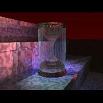
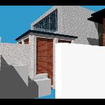 Hmm, just realised that the "workspace" project (which eventually became part of my thesis project) is already in my portfolio, as was the pim project. Oh well, maybe I've already got everything online. The little hourglass was done with AccuRender in AutoCAD back far enough that it took a few days on a really beefy workstation to render just that simple little scene. The workspace project was something I designed back in first year architecture. I returned to the design as a shell into which to place my final thesis project. This rendering is from the thesis period, as I was trying to get the feel for the new rendering possibilities. The concrete wall in the foreground eventually found its way to a more natural material setting :) .
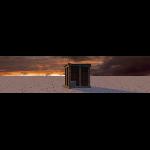
 The image on the left was done as part of my web-site in the months between my first and second years of Independent Studies, when I was considering dropping out to work in the Internet boom. It's the storage shed from the workspace project mentioned above rendered in a trivial environment using AccuRender. Note the effect the asymmetrical planter-backing concrete has on the composition. While everything else is simple and ordered, there's this one piece with no visible reason for being there.
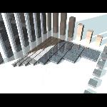
The second rendering was done as part of my thesis studies. Van der Laan was a dutch architect and monk who came up with a generative/limiting geometric scheme based on observation and experimentation with people's perception of "grouping" of objects. This little collection of marble [corr: granite, should look at the things when writing the description] blocks follows the resulting geometric principles, showing all of the proper forms that Van der Laan suggested. (Note: it's been quite a few years since I did this rendering, so I have forgotten most of what it was about... have to review my notes one of these days.)
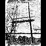 The Matre project was already in my portfolio, but it was missing this sketch. I've never really been good at sketching, so I always felt this piece just didn't deserve to be included, but looking at it now, I figure it's no worse than much of the stuff I inflict upon an unsuspecting world :) . This is the last element in the Matre set. Matre proceeds from the longhouse that was already in the portfolio through a covered campfire in the middle of the island via a very faint path from the back of the campfire to this burial platform turned meditation spot. The whole project was done as an experiment over the summer of 1994, to try to understand the poorly explained ideas that the profs were trying to communicate during my first year in architecture...
Hmm, I seem to be rambling far too much. Anyway, people, there's images to click on. Click away.
Pingbacks
Pingbacks are closed.

Comments
Comments are closed.