On Limiting Languages (Old images from my thesis prompt a post...)
Written by
on
in
Design Theory.
I happened upon a description of the Plastic Number as I was noodling about doing system backups and the like. For those not familiar with it, the Plastic Number is a proportional system developed by a Dutch monk which was based on experiments to determine perceptually what we are able to distinguish and compare.
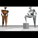
 van der Laan's work was one of those areas that my thesis supervisor pointed out I'd missed in my thesis' attempt to cover all major theories in design theory. No big deal, the thesis quite readily allowed for explaining the Plastic Number as a potential tool for the architect. But what came out of exploring the proportional system, more than anything particularly different about the system itself (in the end, all limiting/generative systems have about the same utility and pitfalls for practice, regardless of how much they seem to be based on an absolute truth) though its genesis was interesting as a comparison to less scientifically-minded systems, was a quick little rendering I did to try to visualise the relationships described by the Plastic Number.
It was a trivial piece of work, but it does have a rather "clean, pure" feeling to it. It also winds up as the first image link on a google search for "Plastic Number". In effect, it is just an essay on beauty. No complications of functionality, or cultural constraints, just "what shapes go together". The rendering itself is trivial, just some stock materials and a bit of lighting. No more than a few hours work (back on the computers of the day it was a little more than it would be today). Absent any other information, you can see the orderliness of the proportional system, and it feels "good". So, the image is attractive. That's nice.

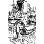
 The truly trivial so often is the stuff that "sells". The "clutter" sketch, which was just something I did to fill the time while sitting at my mother's place, was my first work to be picked up by a regular publication (an e-zine). My minimalist "Platinum" avatar was used for years in Holodesk, though she was originally just a demonstration for the design staff of using minimalism to speed up the system without sacrificing performance.
Which reflects on the power of limiting languages in general. Design is a search through an infinite topological space. A limiting language constrains the design space by making decisions automatically based on first moves by the designer. This should allow the architect to focus on the "real" issues of the design. The danger is that the limiting language then becomes assumed, something that the architect cannot revisit, becoming a law, rather than a tool. At its best, the proportional system provides the architect with a sort of magic companion that answers the "how big should it be" questions semi-automatically, letting the architect block in a space according to geometric principles and then move onto the next question. When misused, the proportional system can turn design into merely playing with blocks, a sort of low compositionalism that produces pretty, but ultimately uninspired designs.
If a designer makes a classical building 30m wide with a given order, she can almost let a computer fill in the rest of the details. But the intellectual content of the building, its ability to reflect on the nature of existence and the meaning of our lives, is then reduced to "30m, Ionic"... and then why do we bother with the designer at all? Pretty isn't hard, you see. We walk into it blind half the time. It is bringing meaning to life that is the real challenge we have to meet with our designs.
Yet still, it is pretty that sells.
Pingbacks
Pingbacks are closed.

Comments
Comments are closed.